


InfoGrab DocsInfoGrab Docs

노드 UI 요소

요약

n8n은 사용자가 모든 종류의 데이터 유형을 입력할 수 있도록 (JSON 파일 기반의) 미리 정의된 UI 컴포넌트 집합을 제공합니다. 비밀번호 입력을 위한 String 필드: 두 줄 이상을 지원하는 String 필드: 사용자는 데이터 값을 드래그 앤 드롭하여 필드에 매핑할 수 있습니다.

n8n은 사용자가 모든 종류의 데이터 유형을 입력할 수 있도록 (JSON 파일 기반의) 미리 정의된 UI 컴포넌트 집합을 제공합니다. 다음은 n8n에서 사용할 수 있는 UI 요소들입니다.

String#

기본 구성:

{
	displayName: Name, // The value the user sees in the UI
	name: name, // The name used to reference the element UI within the code
	type: string,
	required: true, // Whether the field is required or not
	default: 'n8n',
	description: 'The name of the user',
	displayOptions: { // the resources and operations to display this element with
		show: {
			resource: [
				// comma-separated list of resource names
			],
			operation: [
				// comma-separated list of operation names
			]
		}
	},
}

String

비밀번호 입력을 위한 String 필드:

{
	displayName: 'Password',
	name: 'password',
	type: 'string',
	required: true,
	typeOptions: {
		password: true,
	},
	default: '',
	description: `User's password`,
	displayOptions: { // the resources and operations to display this element with
		show: {
			resource: [
				// comma-separated list of resource names
			],
			operation: [
				// comma-separated list of operation names
			]
		}
	},
}

Password

두 줄 이상을 지원하는 String 필드:

{
	displayName: 'Description',
	name: 'description',
	type: 'string',
	required: true,
	typeOptions: {
		rows: 4,
	},
	default: '',
	description: 'Description',
	displayOptions: { // the resources and operations to display this element with
		show: {
			resource: [
				// comma-separated list of resource names
			],
			operation: [
				// comma-separated list of operation names
			]
		}
	},
}
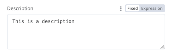
Multiple rows

데이터 키에 대한 드래그 앤 드롭 지원#

사용자는 데이터 값을 드래그 앤 드롭하여 필드에 매핑할 수 있습니다. 드래그 앤 드롭을 하면 데이터 값을 로드하는 표현식1이 생성됩니다. n8n은 이를 자동으로 지원합니다.

데이터 키의 드래그 앤 드롭을 지원하려면 추가 구성 옵션을 추가해야 합니다.

  • requiresDataPath: 'single': 단일 문자열을 요구하는 필드용입니다.
  • requiresDataPath: 'multiple': 쉼표로 구분된 문자열 목록을 받을 수 있는 필드용입니다.

Compare Datasets node 코드에 예시가 있습니다.

Number#

소수점을 지원하는 Number 필드:

{
	displayName: 'Amount',
	name: 'amount',
	type: 'number',
	required: true,
	typeOptions: {
		maxValue: 10,
		minValue: 0,
		numberPrecision: 2,
	},
	default: 10.00,
	description: 'Your current amount',
	displayOptions: { // the resources and operations to display this element with
		show: {
			resource: [
				// comma-separated list of resource names
			],
			operation: [
				// comma-separated list of operation names
			]
		}
	},
}

Decimal

컬렉션#

선택적 필드를 표시해야 할 때 collection 유형을 사용합니다.

{
	displayName: 'Filters',
	name: 'filters',
	type: 'collection',
	placeholder: 'Add Field',
	default: {},
	options: [
		{
			displayName: 'Type',
			name: 'type',
			type: 'options',
			options: [
				{
					name: 'Automated',
					value: 'automated',
				},
				{
					name: 'Past',
					value: 'past',
				},
				{
					name: 'Upcoming',
					value: 'upcoming',
				},
			],
			default: '',
		},
	],
	displayOptions: { // the resources and operations to display this element with
		show: {
			resource: [
				// comma-separated list of resource names
			],
			operation: [
				// comma-separated list of operation names
			]
		}
	},
}
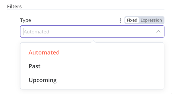
Collection

DateTime#

dateTime 유형은 날짜 선택기를 제공합니다.

{
	displayName: 'Modified Since',
	name: 'modified_since',
	type: 'dateTime',
	default: '',
	description: 'The date and time when the file was last modified',
	displayOptions: { // the resources and operations to display this element with
		show: {
			resource: [
				// comma-separated list of resource names
			],
			operation: [
				// comma-separated list of operation names
			]
		}
	},
}
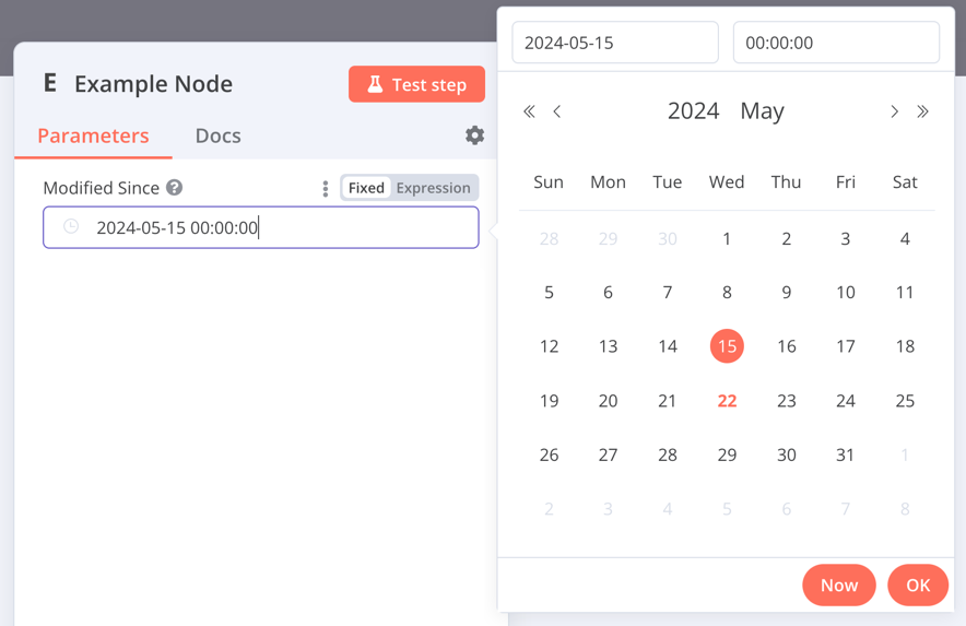
DateTime

Boolean#

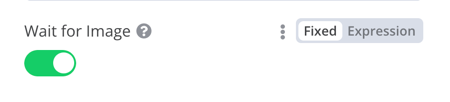
boolean 유형은 참/거짓을 입력하기 위한 토글을 추가합니다.

{
	displayName: 'Wait for Image',
	name: 'waitForImage',
	type: 'boolean',
	default: true, // Initial state of the toggle
	description: 'Whether to wait for the image or not',
	displayOptions: { // the resources and operations to display this element with
		show: {
			resource: [
				// comma-separated list of resource names
			],
			operation: [
				// comma-separated list of operation names
			]
		}
	},
}
Boolean

Color#

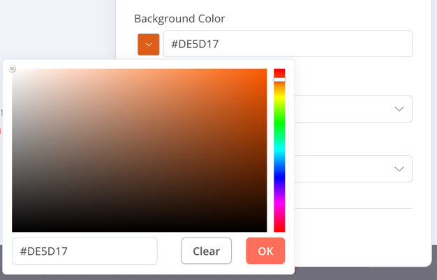
color 유형은 색상 선택기를 제공합니다.

{
	displayName: 'Background Color',
	name: 'backgroundColor',
	type: 'color',
	default: '', // Initially selected color
	displayOptions: { // the resources and operations to display this element with
		show: {
			resource: [
				// comma-separated list of resource names
			],
			operation: [
				// comma-separated list of operation names
			]
		}
	},
}
Color

옵션#

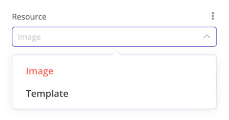
options 유형은 옵션 목록을 추가합니다. 사용자는 하나의 값만 선택할 수 있습니다.

{
	displayName: 'Resource',
	name: 'resource',
	type: 'options',
	options: [
		{
			name: 'Image',
			value: 'image',
		},
		{
			name: 'Template',
			value: 'template',
		},
	],
	default: 'image', // The initially selected option
	description: 'Resource to consume',
	displayOptions: { // the resources and operations to display this element with
		show: {
			resource: [
				// comma-separated list of resource names
			],
			operation: [
				// comma-separated list of operation names
			]
		}
	},
}
Options

다중 선택#

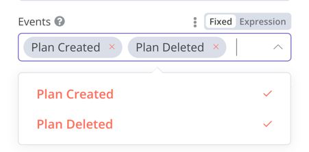
multiOptions 유형은 옵션 목록을 추가합니다. 사용자는 하나 이상의 값을 선택할 수 있습니다.

{
	displayName: 'Events',
	name: 'events',
	type: 'multiOptions',
	options: [
		{
			name: 'Plan Created',
			value: 'planCreated',
		},
		{
			name: 'Plan Deleted',
			value: 'planDeleted',
		},
	],
	default: [], // Initially selected options
	description: 'The events to be monitored',
	displayOptions: { // the resources and operations to display this element with
		show: {
			resource: [
				// comma-separated list of resource names
			],
			operation: [
				// comma-separated list of operation names
			]
		}
	},
}
Multi-options

필터#

들어오는 데이터를 평가하거나, 매칭하거나, 필터링할 때 이 컴포넌트를 사용합니다.

다음은 n8n 자체의 If node에서 가져온 코드입니다. 사용자가 필터 동작을 구성할 수 있는 collection 컴포넌트와 함께 작동하는 filter 컴포넌트를 보여줍니다.

{
	displayName: 'Conditions',
	name: 'conditions',
	placeholder: 'Add Condition',
	type: 'filter',
	default: {},
	typeOptions: {
		filter: {
			// Use the user options (below) to determine filter behavior
			caseSensitive: '={{!$parameter.options.ignoreCase}}',
			typeValidation: '={{$parameter.options.looseTypeValidation ? "loose" : "strict"}}',
		},
	},
},
{
displayName: 'Options',
name: 'options',
type: 'collection',
placeholder: 'Add option',
default: {},
options: [
	{
		displayName: 'Ignore Case',
		description: 'Whether to ignore letter case when evaluating conditions',
		name: 'ignoreCase',
		type: 'boolean',
		default: true,
	},
	{
		displayName: 'Less Strict Type Validation',
		description: 'Whether to try casting value types based on the selected operator',
		name: 'looseTypeValidation',
		type: 'boolean',
		default: true,
	},
],
},
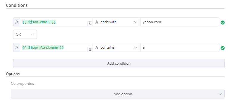
Filter

할당 컬렉션(드래그 앤 드롭)#

사용자가 한 번의 드래그 조작으로 name과 value 매개변수를 미리 채우도록 하려면 드래그 앤 드롭 컴포넌트를 사용합니다.

{
	displayName: 'Fields to Set',
	name: 'assignments',
	type: 'assignmentCollection',
	default: {},
},

n8n의 Edit Fields (Set) node에서 예시를 확인할 수 있습니다.

A gif showing the drag and drop action, as well as changing a field to fixed

고정 컬렉션#

의미적으로 관련된 필드를 그룹화하려면 fixedCollection 유형을 사용합니다.

{
	displayName: 'Metadata',
	name: 'metadataUi',
	placeholder: 'Add Metadata',
	type: 'fixedCollection',
	default: '',
	typeOptions: {
		multipleValues: true,
	},
	description: '',
	options: [
		{
			name: 'metadataValues',
			displayName: 'Metadata',
			values: [
				{
					displayName: 'Name',
					name: 'name',
					type: 'string',
					default: 'Name of the metadata key to add.',
				},
				{
					displayName: 'Value',
					name: 'value',
					type: 'string',
					default: '',
					description: 'Value to set for the metadata key.',
				},
			],
		},
	],
	displayOptions: { // the resources and operations to display this element with
		show: {
			resource: [
				// comma-separated list of resource names
			],
			operation: [
				// comma-separated list of operation names
			]
		}
	},
}
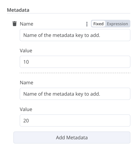
Fixed collection

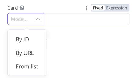
리소스 로케이터#

Resource locator

Resource locator 요소는 사용자가 Trello의 카드나 라벨처럼 외부 서비스에서 특정 리소스를 찾을 수 있도록 돕습니다.

다음 옵션을 사용할 수 있습니다.

  • ID
  • URL
  • List: 사용자가 미리 채워진 목록에서 선택하거나 검색할 수 있도록 합니다. 이 옵션은 목록을 채우고 검색 지원 여부를 처리해야 하므로 더 많은 코딩이 필요합니다.

포함할 유형을 선택할 수 있습니다.

예시:

{
	displayName: 'Card',
	name: 'cardID',
	type: 'resourceLocator',
	default: '',
	description: 'Get a card',
	modes: [
		{
			displayName: 'ID',
			name: 'id',
			type: 'string',
			hint: 'Enter an ID',
			validation: [
				{
					type: 'regex',
					properties: {
						regex: '^[0-9]',
						errorMessage: 'The ID must start with a number',
					},
				},
			],
			placeholder: '12example',
			// How to use the ID in API call
			url: '=http://api-base-url.com/?id={{$value}}',
		},
		{
			displayName: 'URL',
			name: 'url',
			type: 'string',
			hint: 'Enter a URL',
			validation: [
				{
					type: 'regex',
					properties: {
						regex: '^http',
						errorMessage: 'Invalid URL',
					},
				},
			],
			placeholder: 'https://example.com/card/12example/',
			// How to get the ID from the URL
			extractValue: {
				type: 'regex',
				regex: 'example.com/card/([0-9]*.*)/',
			},
		},
		{
			displayName: 'List',
			name: 'list',
			type: 'list',
			typeOptions: {
				// You must always provide a search method
				// Write this method within the methods object in your base file
				// The method must populate the list, and handle searching if searchable: true
				searchListMethod: 'searchMethod',
				// If you want users to be able to search the list
				searchable: true,
				// Set to true if you want to force users to search
				// When true, users can't browse the list
				// Or false if users can browse a list
				searchFilterRequired: true,
			},
		},
	],
	displayOptions: {
		// the resources and operations to display this element with
		show: {
			resource: [
				// comma-separated list of resource names
			],
			operation: [
				// comma-separated list of operation names
			],
		},
	},
},

다음 실제 예시를 참고하세요.

  • n8n의 Trello node에서 searchFilterRequired: true가 포함된 검색 기능이 있는 list의 예시는 CardDescription.tsTrello.node.ts를 참고하세요.
  • 사용자가 목록을 탐색하거나 검색할 수 있는 예시는 GoogleDrive.node.ts를 참고하세요.

리소스 매퍼#

노드가 삽입, 업데이트, 또는 upsert 작업을 수행하는 경우, 연동 중인 서비스가 지원하는 형식으로 노드에서 데이터를 전송해야 합니다. 일반적인 패턴은 데이터를 전송하는 노드 앞에 Set node를 두어 연결하려는 서비스의 스키마에 맞게 데이터를 변환하는 것입니다. Resource mapper UI 컴포넌트는 Set node를 사용하지 않고도 노드 내에서 직접 필요한 형식으로 데이터를 가져올 수 있는 방법을 제공합니다. Resource mapper 컴포넌트는 또한 노드에 제공된 스키마를 기준으로 입력 데이터를 검증하고, 입력 데이터를 예상 타입으로 캐스팅할 수 있습니다.

Note

매핑과 매칭

매핑(Mapping)은 행(row)을 업데이트할 때 값으로 사용할 입력 데이터를 설정하는 과정입니다. 매칭(Matching)은 업데이트할 행을 식별하기 위해 열 이름을 사용하는 과정입니다.

{
	displayName: 'Columns',
	name: 'columns', // The name used to reference the element UI within the code
	type: 'resourceMapper', // The UI element type
	default: {
		// mappingMode can be defined in the component (mappingMode: 'defineBelow')
		// or you can attempt automatic mapping (mappingMode: 'autoMapInputData')
		mappingMode: 'defineBelow',
		// Important: always set default value to null
		value: null,
	},
	required: true,
	// See "Resource mapper type options interface" below for the full typeOptions specification
	typeOptions: {
		resourceMapper: {
			resourceMapperMethod: 'getMappingColumns',
			mode: 'update',
			fieldWords: {
				singular: 'column',
				plural: 'columns',
			},
			addAllFields: true, 
			multiKeyMatch: true,
			supportAutoMap: true,
			matchingFieldsLabels: {
				title: 'Custom matching columns title',
				description: 'Help text for custom matching columns',
				hint: 'Below-field hint for custom matching columns',
			},
		},
	},
},

데이터베이스 스키마를 사용하는 실제 예시는 Postgres node (version 2)를 참고하세요.

스키마가 없는 서비스를 사용하는 실제 예시는 Google Sheets node (version 2)를 참고하세요.

Resource mapper 타입 옵션 인터페이스#

typeOptions 섹션은 다음 인터페이스를 구현해야 합니다.

export interface ResourceMapperTypeOptions {
	// The name of the method where you fetch the schema
	// Refer to the Resource mapper method section for more detail
	resourceMapperMethod: string;
	// Choose the mode for your operation
	// Supported modes: add, update, upsert
	mode: 'add' | 'update' | 'upsert';
	// Specify labels for fields in the UI
	fieldWords?: { singular: string; plural: string };
	// Whether n8n should display a UI input for every field when node first added to workflow
	// Default is true
	addAllFields?: boolean;
	// Specify a message to show if no fields are fetched from the service 
	// (the call is successful but the response is empty)
	noFieldsError?: string;
	// Whether to support multi-key column matching
	// multiKeyMatch is for update and upsert only
	// Default is false
	// If true, the node displays a multi-select dropdown for the matching column selector
	multiKeyMatch?: boolean;
	// Whether to support automatic mapping
	// If false, n8n hides the mapping mode selector field and sets mappingMode to defineBelow
	supportAutoMap?: boolean;
	// Custom labels for the matching columns selector
	matchingFieldsLabels?: {
		title?: string;
		description?: string;
		hint?: string;
	};
}

Resource mapper 메서드#

이 메서드에는 데이터 스키마를 가져오기 위한 노드별 로직이 포함됩니다. 모든 노드는 스키마를 가져오고 스키마에 따라 각 UI 필드를 설정하는 자체 로직을 구현해야 합니다.

이 메서드는 ResourceMapperFields 인터페이스를 구현하는 값을 반환해야 합니다.

interface ResourceMapperField {
	// Field ID as in the service
	id: string;
	// Field label
	displayName: string;
	// Whether n8n should pre-select the field as a matching field
	// A matching field is a column used to identify the rows to modify
	defaultMatch: boolean;
	// Whether the field can be used as a matching field
	canBeUsedToMatch?: boolean;
	// Whether the field is required by the schema
	required: boolean;
	// Whether to display the field in the UI
	// If false, can't be used for matching or mapping
	display: boolean;
	// The data type for the field
	// These correspond to UI element types
	// Supported types: string, number, dateTime, boolean, time, array, object, options
	type?: FieldType;
	// Added at runtime if the field is removed from mapping by the user
	removed?: boolean;
	// Specify options for enumerated types
	options?: INodePropertyOptions[];
}

실제 예시는 Postgres resource mapping methodGoogle Sheets resource mapping method를 참고하세요.

JSON#

{
	displayName: 'Content (JSON)',
	name: 'content',
	type: 'json',
	default: '',
	description: '',
	displayOptions: { // the resources and operations to display this element with
		show: {
			resource: [
				// comma-separated list of resource names
			],
			operation: [
				// comma-separated list of operation names
			]
		}
	},
}
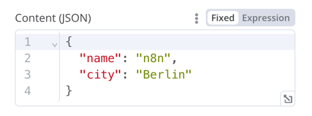
JSON

HTML#

HTML 편집기를 사용하면 사용자가 워크플로에서 HTML 템플릿을 만들 수 있습니다. 이 편집기는 표준 HTML, <style> 태그의 CSS, 그리고 {{}}로 감싼 표현식을 지원합니다. 사용자는 <script> 태그를 추가하여 추가 JavaScript를 가져올 수 있습니다. n8n은 워크플로 실행 중에 이 JavaScript를 실행하지 않습니다.

{
	displayName: 'HTML Template', // The value the user sees in the UI
	name: 'html', // The name used to reference the element UI within the code
	type: 'string',
	typeOptions: {
		editor: 'htmlEditor',
	},
	default: placeholder, // Loads n8n's placeholder HTML template
	noDataExpression: true, // Prevent using an expression for the field
	description: 'HTML template to render',
},

실제 예시는 Html.node.ts를 참고하세요.

알림#

힌트나 추가 정보를 표시하는 노란색 상자입니다. 좋은 힌트와 안내 텍스트를 작성하는 방법은 Node UI design을 참고하세요.

{
  displayName: 'Your text here',
  name: 'notice',
  type: 'notice',
  default: '',
},

Notice

힌트#

힌트에는 파라미터 힌트와 노드 힌트, 두 가지 유형이 있습니다.

  • 파라미터 힌트는 사용자 입력 필드 아래에 표시되는 짧은 한 줄짜리 텍스트입니다.
  • 노드 힌트는 Notice보다 더 강력하고 유연한 옵션입니다. 입력 패널, 출력 패널, 또는 노드 상세 보기에서 더 긴 힌트를 표시할 때 사용합니다.

파라미터 힌트 추가하기#

UI 요소에 hint 파라미터를 추가합니다.

{
	displayName: 'URL',
	name: 'url',
	type: 'string',
	hint: 'Enter a URL',
	...
}

노드 힌트 추가하기#

노드 description 내의 hints 속성에서 노드의 힌트를 정의합니다.

description: INodeTypeDescription = {
	...
	hints: [
		{
			// The hint message. You can use HTML.
			message: "This node has many input items. Consider enabling <b>Execute Once</b> in the node\'s settings.",
			// Choose from: info, warning, danger. The default is 'info'.
			// Changes the color. info (grey), warning (yellow), danger (red)
			type: 'info',
			// Choose from: inputPane, outputPane, ndv. By default n8n displays the hint in both the input and output panels.
			location: 'outputPane',
			// Choose from: always, beforeExecution, afterExecution. The default is 'always'
			whenToDisplay: 'beforeExecution',
			// Optional. An expression. If it resolves to true, n8n displays the message. Defaults to true.
			displayCondition: '={{ $parameter["operation"] === "select" && $input.all().length > 1 }}'
		}
	]
	...
}

프로그래매틱 스타일 노드에 동적 힌트 추가하기#

프로그래매틱 스타일 노드에서는 노드 실행 정보를 포함하는 동적 메시지를 만들 수 있습니다. 노드 출력 데이터에 의존하기 때문에 실행이 끝난 후에만 이 유형의 힌트를 표시할 수 있습니다.

if (operation === 'select' && items.length > 1 && !node.executeOnce) {
    // Expects two parameters: NodeExecutionData and an array of hints
	return new NodeExecutionOutput(
		[returnData],
		[
			{
				message: `This node ran ${items.length} times, once for each input item. To run for the first item only, enable <b>Execute once</b> in the node settings.`,
				location: 'outputPane',
			},
		],
	);
}
return [returnData];

프로그래매틱 스타일 노드에서 동적 힌트의 실제 예시는 Split Out node 코드를 참고하세요.

Footnotes

  1. n8n에서 표현식(expression)을 사용하면 JavaScript 코드를 실행하여 노드 파라미터를 동적으로 채울 수 있습니다. 정적인 값을 제공하는 대신, n8n 표현식 문법을 사용하여 이전 노드, 다른 워크플로, 또는 n8n 환경의 데이터를 사용해 값을 정의할 수 있습니다.

노드 UI 요소

n8n v2.29
원문 보기
요약

n8n은 사용자가 모든 종류의 데이터 유형을 입력할 수 있도록 (JSON 파일 기반의) 미리 정의된 UI 컴포넌트 집합을 제공합니다. 비밀번호 입력을 위한 String 필드: 두 줄 이상을 지원하는 String 필드: 사용자는 데이터 값을 드래그 앤 드롭하여 필드에 매핑할 수 있습니다.

n8n은 사용자가 모든 종류의 데이터 유형을 입력할 수 있도록 (JSON 파일 기반의) 미리 정의된 UI 컴포넌트 집합을 제공합니다. 다음은 n8n에서 사용할 수 있는 UI 요소들입니다.

String#

기본 구성:

{
	displayName: Name, // The value the user sees in the UI
	name: name, // The name used to reference the element UI within the code
	type: string,
	required: true, // Whether the field is required or not
	default: 'n8n',
	description: 'The name of the user',
	displayOptions: { // the resources and operations to display this element with
		show: {
			resource: [
				// comma-separated list of resource names
			],
			operation: [
				// comma-separated list of operation names
			]
		}
	},
}

String

비밀번호 입력을 위한 String 필드:

{
	displayName: 'Password',
	name: 'password',
	type: 'string',
	required: true,
	typeOptions: {
		password: true,
	},
	default: '',
	description: `User's password`,
	displayOptions: { // the resources and operations to display this element with
		show: {
			resource: [
				// comma-separated list of resource names
			],
			operation: [
				// comma-separated list of operation names
			]
		}
	},
}

Password

두 줄 이상을 지원하는 String 필드:

{
	displayName: 'Description',
	name: 'description',
	type: 'string',
	required: true,
	typeOptions: {
		rows: 4,
	},
	default: '',
	description: 'Description',
	displayOptions: { // the resources and operations to display this element with
		show: {
			resource: [
				// comma-separated list of resource names
			],
			operation: [
				// comma-separated list of operation names
			]
		}
	},
}

Multiple rows

데이터 키에 대한 드래그 앤 드롭 지원#

사용자는 데이터 값을 드래그 앤 드롭하여 필드에 매핑할 수 있습니다. 드래그 앤 드롭을 하면 데이터 값을 로드하는 표현식1이 생성됩니다. n8n은 이를 자동으로 지원합니다.

데이터 키의 드래그 앤 드롭을 지원하려면 추가 구성 옵션을 추가해야 합니다.

  • requiresDataPath: 'single': 단일 문자열을 요구하는 필드용입니다.
  • requiresDataPath: 'multiple': 쉼표로 구분된 문자열 목록을 받을 수 있는 필드용입니다.

Compare Datasets node 코드에 예시가 있습니다.

Number#

소수점을 지원하는 Number 필드:

{
	displayName: 'Amount',
	name: 'amount',
	type: 'number',
	required: true,
	typeOptions: {
		maxValue: 10,
		minValue: 0,
		numberPrecision: 2,
	},
	default: 10.00,
	description: 'Your current amount',
	displayOptions: { // the resources and operations to display this element with
		show: {
			resource: [
				// comma-separated list of resource names
			],
			operation: [
				// comma-separated list of operation names
			]
		}
	},
}

Decimal

컬렉션#

선택적 필드를 표시해야 할 때 collection 유형을 사용합니다.

{
	displayName: 'Filters',
	name: 'filters',
	type: 'collection',
	placeholder: 'Add Field',
	default: {},
	options: [
		{
			displayName: 'Type',
			name: 'type',
			type: 'options',
			options: [
				{
					name: 'Automated',
					value: 'automated',
				},
				{
					name: 'Past',
					value: 'past',
				},
				{
					name: 'Upcoming',
					value: 'upcoming',
				},
			],
			default: '',
		},
	],
	displayOptions: { // the resources and operations to display this element with
		show: {
			resource: [
				// comma-separated list of resource names
			],
			operation: [
				// comma-separated list of operation names
			]
		}
	},
}

Collection

DateTime#

dateTime 유형은 날짜 선택기를 제공합니다.

{
	displayName: 'Modified Since',
	name: 'modified_since',
	type: 'dateTime',
	default: '',
	description: 'The date and time when the file was last modified',
	displayOptions: { // the resources and operations to display this element with
		show: {
			resource: [
				// comma-separated list of resource names
			],
			operation: [
				// comma-separated list of operation names
			]
		}
	},
}

DateTime

Boolean#

boolean 유형은 참/거짓을 입력하기 위한 토글을 추가합니다.

{
	displayName: 'Wait for Image',
	name: 'waitForImage',
	type: 'boolean',
	default: true, // Initial state of the toggle
	description: 'Whether to wait for the image or not',
	displayOptions: { // the resources and operations to display this element with
		show: {
			resource: [
				// comma-separated list of resource names
			],
			operation: [
				// comma-separated list of operation names
			]
		}
	},
}

Boolean

Color#

color 유형은 색상 선택기를 제공합니다.

{
	displayName: 'Background Color',
	name: 'backgroundColor',
	type: 'color',
	default: '', // Initially selected color
	displayOptions: { // the resources and operations to display this element with
		show: {
			resource: [
				// comma-separated list of resource names
			],
			operation: [
				// comma-separated list of operation names
			]
		}
	},
}

Color

옵션#

options 유형은 옵션 목록을 추가합니다. 사용자는 하나의 값만 선택할 수 있습니다.

{
	displayName: 'Resource',
	name: 'resource',
	type: 'options',
	options: [
		{
			name: 'Image',
			value: 'image',
		},
		{
			name: 'Template',
			value: 'template',
		},
	],
	default: 'image', // The initially selected option
	description: 'Resource to consume',
	displayOptions: { // the resources and operations to display this element with
		show: {
			resource: [
				// comma-separated list of resource names
			],
			operation: [
				// comma-separated list of operation names
			]
		}
	},
}

Options

다중 선택#

multiOptions 유형은 옵션 목록을 추가합니다. 사용자는 하나 이상의 값을 선택할 수 있습니다.

{
	displayName: 'Events',
	name: 'events',
	type: 'multiOptions',
	options: [
		{
			name: 'Plan Created',
			value: 'planCreated',
		},
		{
			name: 'Plan Deleted',
			value: 'planDeleted',
		},
	],
	default: [], // Initially selected options
	description: 'The events to be monitored',
	displayOptions: { // the resources and operations to display this element with
		show: {
			resource: [
				// comma-separated list of resource names
			],
			operation: [
				// comma-separated list of operation names
			]
		}
	},
}

Multi-options

필터#

들어오는 데이터를 평가하거나, 매칭하거나, 필터링할 때 이 컴포넌트를 사용합니다.

다음은 n8n 자체의 If node에서 가져온 코드입니다. 사용자가 필터 동작을 구성할 수 있는 collection 컴포넌트와 함께 작동하는 filter 컴포넌트를 보여줍니다.

{
	displayName: 'Conditions',
	name: 'conditions',
	placeholder: 'Add Condition',
	type: 'filter',
	default: {},
	typeOptions: {
		filter: {
			// Use the user options (below) to determine filter behavior
			caseSensitive: '={{!$parameter.options.ignoreCase}}',
			typeValidation: '={{$parameter.options.looseTypeValidation ? "loose" : "strict"}}',
		},
	},
},
{
displayName: 'Options',
name: 'options',
type: 'collection',
placeholder: 'Add option',
default: {},
options: [
	{
		displayName: 'Ignore Case',
		description: 'Whether to ignore letter case when evaluating conditions',
		name: 'ignoreCase',
		type: 'boolean',
		default: true,
	},
	{
		displayName: 'Less Strict Type Validation',
		description: 'Whether to try casting value types based on the selected operator',
		name: 'looseTypeValidation',
		type: 'boolean',
		default: true,
	},
],
},

Filter

할당 컬렉션(드래그 앤 드롭)#

사용자가 한 번의 드래그 조작으로 name과 value 매개변수를 미리 채우도록 하려면 드래그 앤 드롭 컴포넌트를 사용합니다.

{
	displayName: 'Fields to Set',
	name: 'assignments',
	type: 'assignmentCollection',
	default: {},
},

n8n의 Edit Fields (Set) node에서 예시를 확인할 수 있습니다.

A gif showing the drag and drop action, as well as changing a field to fixed

고정 컬렉션#

의미적으로 관련된 필드를 그룹화하려면 fixedCollection 유형을 사용합니다.

{
	displayName: 'Metadata',
	name: 'metadataUi',
	placeholder: 'Add Metadata',
	type: 'fixedCollection',
	default: '',
	typeOptions: {
		multipleValues: true,
	},
	description: '',
	options: [
		{
			name: 'metadataValues',
			displayName: 'Metadata',
			values: [
				{
					displayName: 'Name',
					name: 'name',
					type: 'string',
					default: 'Name of the metadata key to add.',
				},
				{
					displayName: 'Value',
					name: 'value',
					type: 'string',
					default: '',
					description: 'Value to set for the metadata key.',
				},
			],
		},
	],
	displayOptions: { // the resources and operations to display this element with
		show: {
			resource: [
				// comma-separated list of resource names
			],
			operation: [
				// comma-separated list of operation names
			]
		}
	},
}

Fixed collection

리소스 로케이터#

Resource locator

Resource locator 요소는 사용자가 Trello의 카드나 라벨처럼 외부 서비스에서 특정 리소스를 찾을 수 있도록 돕습니다.

다음 옵션을 사용할 수 있습니다.

  • ID
  • URL
  • List: 사용자가 미리 채워진 목록에서 선택하거나 검색할 수 있도록 합니다. 이 옵션은 목록을 채우고 검색 지원 여부를 처리해야 하므로 더 많은 코딩이 필요합니다.

포함할 유형을 선택할 수 있습니다.

예시:

{
	displayName: 'Card',
	name: 'cardID',
	type: 'resourceLocator',
	default: '',
	description: 'Get a card',
	modes: [
		{
			displayName: 'ID',
			name: 'id',
			type: 'string',
			hint: 'Enter an ID',
			validation: [
				{
					type: 'regex',
					properties: {
						regex: '^[0-9]',
						errorMessage: 'The ID must start with a number',
					},
				},
			],
			placeholder: '12example',
			// How to use the ID in API call
			url: '=http://api-base-url.com/?id={{$value}}',
		},
		{
			displayName: 'URL',
			name: 'url',
			type: 'string',
			hint: 'Enter a URL',
			validation: [
				{
					type: 'regex',
					properties: {
						regex: '^http',
						errorMessage: 'Invalid URL',
					},
				},
			],
			placeholder: 'https://example.com/card/12example/',
			// How to get the ID from the URL
			extractValue: {
				type: 'regex',
				regex: 'example.com/card/([0-9]*.*)/',
			},
		},
		{
			displayName: 'List',
			name: 'list',
			type: 'list',
			typeOptions: {
				// You must always provide a search method
				// Write this method within the methods object in your base file
				// The method must populate the list, and handle searching if searchable: true
				searchListMethod: 'searchMethod',
				// If you want users to be able to search the list
				searchable: true,
				// Set to true if you want to force users to search
				// When true, users can't browse the list
				// Or false if users can browse a list
				searchFilterRequired: true,
			},
		},
	],
	displayOptions: {
		// the resources and operations to display this element with
		show: {
			resource: [
				// comma-separated list of resource names
			],
			operation: [
				// comma-separated list of operation names
			],
		},
	},
},

다음 실제 예시를 참고하세요.

  • n8n의 Trello node에서 searchFilterRequired: true가 포함된 검색 기능이 있는 list의 예시는 CardDescription.tsTrello.node.ts를 참고하세요.
  • 사용자가 목록을 탐색하거나 검색할 수 있는 예시는 GoogleDrive.node.ts를 참고하세요.

리소스 매퍼#

노드가 삽입, 업데이트, 또는 upsert 작업을 수행하는 경우, 연동 중인 서비스가 지원하는 형식으로 노드에서 데이터를 전송해야 합니다. 일반적인 패턴은 데이터를 전송하는 노드 앞에 Set node를 두어 연결하려는 서비스의 스키마에 맞게 데이터를 변환하는 것입니다. Resource mapper UI 컴포넌트는 Set node를 사용하지 않고도 노드 내에서 직접 필요한 형식으로 데이터를 가져올 수 있는 방법을 제공합니다. Resource mapper 컴포넌트는 또한 노드에 제공된 스키마를 기준으로 입력 데이터를 검증하고, 입력 데이터를 예상 타입으로 캐스팅할 수 있습니다.

Note

매핑과 매칭

매핑(Mapping)은 행(row)을 업데이트할 때 값으로 사용할 입력 데이터를 설정하는 과정입니다. 매칭(Matching)은 업데이트할 행을 식별하기 위해 열 이름을 사용하는 과정입니다.

{
	displayName: 'Columns',
	name: 'columns', // The name used to reference the element UI within the code
	type: 'resourceMapper', // The UI element type
	default: {
		// mappingMode can be defined in the component (mappingMode: 'defineBelow')
		// or you can attempt automatic mapping (mappingMode: 'autoMapInputData')
		mappingMode: 'defineBelow',
		// Important: always set default value to null
		value: null,
	},
	required: true,
	// See "Resource mapper type options interface" below for the full typeOptions specification
	typeOptions: {
		resourceMapper: {
			resourceMapperMethod: 'getMappingColumns',
			mode: 'update',
			fieldWords: {
				singular: 'column',
				plural: 'columns',
			},
			addAllFields: true, 
			multiKeyMatch: true,
			supportAutoMap: true,
			matchingFieldsLabels: {
				title: 'Custom matching columns title',
				description: 'Help text for custom matching columns',
				hint: 'Below-field hint for custom matching columns',
			},
		},
	},
},

데이터베이스 스키마를 사용하는 실제 예시는 Postgres node (version 2)를 참고하세요.

스키마가 없는 서비스를 사용하는 실제 예시는 Google Sheets node (version 2)를 참고하세요.

Resource mapper 타입 옵션 인터페이스#

typeOptions 섹션은 다음 인터페이스를 구현해야 합니다.

export interface ResourceMapperTypeOptions {
	// The name of the method where you fetch the schema
	// Refer to the Resource mapper method section for more detail
	resourceMapperMethod: string;
	// Choose the mode for your operation
	// Supported modes: add, update, upsert
	mode: 'add' | 'update' | 'upsert';
	// Specify labels for fields in the UI
	fieldWords?: { singular: string; plural: string };
	// Whether n8n should display a UI input for every field when node first added to workflow
	// Default is true
	addAllFields?: boolean;
	// Specify a message to show if no fields are fetched from the service 
	// (the call is successful but the response is empty)
	noFieldsError?: string;
	// Whether to support multi-key column matching
	// multiKeyMatch is for update and upsert only
	// Default is false
	// If true, the node displays a multi-select dropdown for the matching column selector
	multiKeyMatch?: boolean;
	// Whether to support automatic mapping
	// If false, n8n hides the mapping mode selector field and sets mappingMode to defineBelow
	supportAutoMap?: boolean;
	// Custom labels for the matching columns selector
	matchingFieldsLabels?: {
		title?: string;
		description?: string;
		hint?: string;
	};
}

Resource mapper 메서드#

이 메서드에는 데이터 스키마를 가져오기 위한 노드별 로직이 포함됩니다. 모든 노드는 스키마를 가져오고 스키마에 따라 각 UI 필드를 설정하는 자체 로직을 구현해야 합니다.

이 메서드는 ResourceMapperFields 인터페이스를 구현하는 값을 반환해야 합니다.

interface ResourceMapperField {
	// Field ID as in the service
	id: string;
	// Field label
	displayName: string;
	// Whether n8n should pre-select the field as a matching field
	// A matching field is a column used to identify the rows to modify
	defaultMatch: boolean;
	// Whether the field can be used as a matching field
	canBeUsedToMatch?: boolean;
	// Whether the field is required by the schema
	required: boolean;
	// Whether to display the field in the UI
	// If false, can't be used for matching or mapping
	display: boolean;
	// The data type for the field
	// These correspond to UI element types
	// Supported types: string, number, dateTime, boolean, time, array, object, options
	type?: FieldType;
	// Added at runtime if the field is removed from mapping by the user
	removed?: boolean;
	// Specify options for enumerated types
	options?: INodePropertyOptions[];
}

실제 예시는 Postgres resource mapping methodGoogle Sheets resource mapping method를 참고하세요.

JSON#

{
	displayName: 'Content (JSON)',
	name: 'content',
	type: 'json',
	default: '',
	description: '',
	displayOptions: { // the resources and operations to display this element with
		show: {
			resource: [
				// comma-separated list of resource names
			],
			operation: [
				// comma-separated list of operation names
			]
		}
	},
}

JSON

HTML#

HTML 편집기를 사용하면 사용자가 워크플로에서 HTML 템플릿을 만들 수 있습니다. 이 편집기는 표준 HTML, <style> 태그의 CSS, 그리고 {{}}로 감싼 표현식을 지원합니다. 사용자는 <script> 태그를 추가하여 추가 JavaScript를 가져올 수 있습니다. n8n은 워크플로 실행 중에 이 JavaScript를 실행하지 않습니다.

{
	displayName: 'HTML Template', // The value the user sees in the UI
	name: 'html', // The name used to reference the element UI within the code
	type: 'string',
	typeOptions: {
		editor: 'htmlEditor',
	},
	default: placeholder, // Loads n8n's placeholder HTML template
	noDataExpression: true, // Prevent using an expression for the field
	description: 'HTML template to render',
},

실제 예시는 Html.node.ts를 참고하세요.

알림#

힌트나 추가 정보를 표시하는 노란색 상자입니다. 좋은 힌트와 안내 텍스트를 작성하는 방법은 Node UI design을 참고하세요.

{
  displayName: 'Your text here',
  name: 'notice',
  type: 'notice',
  default: '',
},

Notice

힌트#

힌트에는 파라미터 힌트와 노드 힌트, 두 가지 유형이 있습니다.

  • 파라미터 힌트는 사용자 입력 필드 아래에 표시되는 짧은 한 줄짜리 텍스트입니다.
  • 노드 힌트는 Notice보다 더 강력하고 유연한 옵션입니다. 입력 패널, 출력 패널, 또는 노드 상세 보기에서 더 긴 힌트를 표시할 때 사용합니다.

파라미터 힌트 추가하기#

UI 요소에 hint 파라미터를 추가합니다.

{
	displayName: 'URL',
	name: 'url',
	type: 'string',
	hint: 'Enter a URL',
	...
}

노드 힌트 추가하기#

노드 description 내의 hints 속성에서 노드의 힌트를 정의합니다.

description: INodeTypeDescription = {
	...
	hints: [
		{
			// The hint message. You can use HTML.
			message: "This node has many input items. Consider enabling <b>Execute Once</b> in the node\'s settings.",
			// Choose from: info, warning, danger. The default is 'info'.
			// Changes the color. info (grey), warning (yellow), danger (red)
			type: 'info',
			// Choose from: inputPane, outputPane, ndv. By default n8n displays the hint in both the input and output panels.
			location: 'outputPane',
			// Choose from: always, beforeExecution, afterExecution. The default is 'always'
			whenToDisplay: 'beforeExecution',
			// Optional. An expression. If it resolves to true, n8n displays the message. Defaults to true.
			displayCondition: '={{ $parameter["operation"] === "select" && $input.all().length > 1 }}'
		}
	]
	...
}

프로그래매틱 스타일 노드에 동적 힌트 추가하기#

프로그래매틱 스타일 노드에서는 노드 실행 정보를 포함하는 동적 메시지를 만들 수 있습니다. 노드 출력 데이터에 의존하기 때문에 실행이 끝난 후에만 이 유형의 힌트를 표시할 수 있습니다.

if (operation === 'select' && items.length > 1 && !node.executeOnce) {
    // Expects two parameters: NodeExecutionData and an array of hints
	return new NodeExecutionOutput(
		[returnData],
		[
			{
				message: `This node ran ${items.length} times, once for each input item. To run for the first item only, enable <b>Execute once</b> in the node settings.`,
				location: 'outputPane',
			},
		],
	);
}
return [returnData];

프로그래매틱 스타일 노드에서 동적 힌트의 실제 예시는 Split Out node 코드를 참고하세요.

Footnotes

  1. n8n에서 표현식(expression)을 사용하면 JavaScript 코드를 실행하여 노드 파라미터를 동적으로 채울 수 있습니다. 정적인 값을 제공하는 대신, n8n 표현식 문법을 사용하여 이전 노드, 다른 워크플로, 또는 n8n 환경의 데이터를 사용해 값을 정의할 수 있습니다.